Color Theory: Understanding the Science and Art of Color
Color theory is a fundamental discipline that bridges the worlds of art, science, and design. It represents a conceptual framework that explains how colors interact, combine, and influence human emotions and perceptions. Whether you’re a graphic designer, painter, web developer, or brand strategist, understanding color theory is essential for creating visually compelling and emotionally resonant work. This comprehensive guide explores the principles, applications, and psychological impacts of color theory.
What is Color Theory?
Color theory is the study of how colors work together and their effects on human emotions, behaviors, and perceptions. It encompasses principles and guidelines for combining colors in aesthetically pleasing, harmonious ways. At its core, color theory helps creators and designers make informed decisions about color selection and application in their work.
The fundamental components of color theory include the color wheel, color harmony principles, and the psychological context of color perception. By mastering these elements, designers can create visual compositions that communicate effectively and evoke desired emotional responses from audiences.
The Color Wheel: Foundation of Color Theory
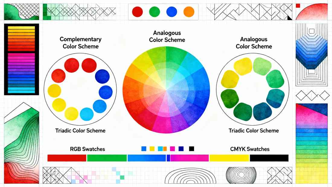
The color wheel is a circular diagram that organizes colors based on their chromatic relationships. It typically includes primary colors (red, blue, and yellow in traditional models), secondary colors (green, orange, and purple—created by mixing two primary colors), and tertiary colors (formed by combining a primary color with a neighboring secondary color).
The color wheel serves as a visual reference guide for understanding color relationships and creating harmonious combinations. It helps designers identify which colors naturally complement each other and which create contrasting effects.
Understanding Color Models: RGB vs. CMYK
Two primary color models dominate design industries: RGB and CMYK, each serving different purposes.
RGB (Red, Green, Blue): An additive color model used for digital designs, including web graphics, television, and mobile interfaces. RGB works by adding light values together. Black is represented as 0, 0, 0 (no light), while white is 255, 255, 255 (maximum light). RGB can produce approximately 16.7 million colors, offering the widest color range available.
CMYK (Cyan, Magenta, Yellow, Black): A subtractive color model used exclusively for printed materials such as business cards, flyers, and t-shirts. In CMYK, colors are created by subtracting light from white paper using pigments. This model produces only approximately 16,000 color possibilities, significantly fewer than RGB.
Understanding when to use each model is critical. RGB designs intended for print may appear significantly duller when converted to CMYK, requiring adjustments during the design process.
Color Harmony: Creating Visual Balance
Color harmony refers to the principles and guidelines for combining colors to create visually appealing compositions. Several common harmony principles include:
Complementary Colors: Colors opposite each other on the color wheel create the highest contrast and most striking visual impact. Examples include blue and orange, or red and green. These combinations produce vibrant, energetic designs.
Analogous Colors: Colors positioned next to each other on the color wheel (within a 90-degree arc) create harmonious, pleasing combinations. These color schemes feel natural and cohesive, making them ideal for calming, sophisticated designs.
Triadic Colors: Three colors equally spaced around the color wheel create a balanced yet vibrant color scheme. This approach produces intense, visually interesting effects while maintaining equilibrium.
Monochromatic Colors: Variations of a single color—different tints, shades, and tones—create sophisticated, unified designs. This approach is elegant and professional.
Color Psychology: The Emotional Impact of Color
Color psychology explores how different colors evoke specific emotions, influence decision-making, and shape human behavior. Research indicates that up to 90% of an initial impression of a product or design comes from color choice alone.
Different colors trigger distinct psychological responses:
- Red: Evokes energy, passion, urgency, and excitement. Often used to prompt immediate action or capture attention.
- Blue: Conveys trust, calmness, stability, and professionalism. Widely used in corporate branding.
- Yellow: Represents optimism, happiness, and energy. However, excessive use can feel overwhelming.
- Green: Associated with nature, growth, healing, and balance. Creates a calming, eco-conscious feel.
- Purple: Conveys luxury, creativity, and spirituality. Often used in premium or artistic branding.
- Orange: Combines the energy of red with the warmth of yellow, creating a friendly, approachable feel.
However, cultural backgrounds, personal experiences, and individual preferences significantly influence how people perceive and respond to colors.
Color Theory in Digital Design
In digital design, color theory plays a crucial role in user experience and interface usability. Strategic color application can:
- Guide User Attention: Using contrasting colors to highlight essential elements or buttons
- Establish Visual Hierarchy: Assigning different colors to headings, subheadings, and body text to organize content
- Communicate Brand Identity: Selecting colors that reflect brand personality and values
- Enhance Accessibility: Ensuring sufficient contrast between text and backgrounds for readability
- Create Emotional Connections: Evoking specific feelings that support the design’s purpose
Modern Color Combinations and Trends
Contemporary design embraces diverse color palettes ranging from pastel combinations to bold neon schemes. Popular 2025 color combinations include:
- Pastel Garden: Deep rose, blush pink, and muted gray-green for sophisticated, romantic designs
- Tuscan Sunset: Terracotta, soft peach, and dusty lavender for warm, elegant aesthetics
- Glowing Horizon: Orange and blue complementary palette for vibrant, energetic designs
- Lavender Lullaby: Tranquil blues and purples for calming, meditative applications
- Neon Dreams: Fluorescent colors combined with neutral tones for maximalist, trendy aesthetics
Conclusion
Color theory represents an essential knowledge base for anyone involved in visual communication, from fine artists to web designers and marketing professionals. By understanding the science of color models, the principles of color harmony, and the psychology of color perception, creators can craft designs that not only capture attention but also communicate effectively and resonate emotionally with their audiences. Whether designing for digital or print media, applying color theory principles ensures that every color choice serves a purposeful, strategic function in achieving design goals.


